Taste has to lead.
Specific flavour, satisfying texture and recognisable sweet-shop pleasure are the product — not a cover story.
Our better
A brighter pack can invite the first look. What earns the second is proper flavour, substantiated claims and information that helps people choose.
Six working standards
These standards turn “better” from a broad promise into a repeatable way of making decisions.
Specific flavour, satisfying texture and recognisable sweet-shop pleasure are the product — not a cover story.
A nutrition or ingredient claim belongs on pack only after the final recipe and evidence support the exact words.
Ingredients, allergens, nutrition, serving information and delivery details should be easy to find and easy to understand.
Resealable, partitioned and individual formats can support choice without policing how somebody eats.
We won’t call food sinful, promote cheat days or use bodies and weight loss to sell a sweet.
Sensory tests, honest feedback and negative comments are useful product information — not inconvenient noise.
The chosen direction
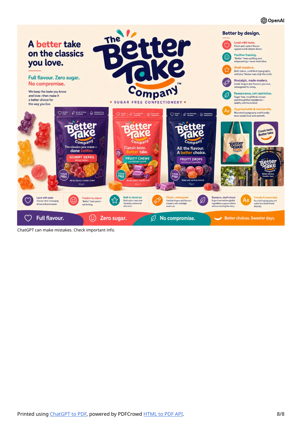
The final design route returns to playful candy character: deep navy for trust, warm cream for clarity, and saturated flavour colours for appetite and shelf impact.
The language test
“Would this still make someone want the sweet if every benefit badge disappeared?”
If not, the flavour story isn’t doing enough yet.
Why this approach
Specific sensory descriptions help people imagine the experience. Health language stays supportive so the product does not feel like a punishment.
Useful nutrition and ingredient details will sit beside product media and the buying action instead of hiding in a distant FAQ.
Weight stigma and moralised food language can do harm. The brand is built around enjoyment, information and choice — never “earning” a treat.